New Eurostar Sculptural Logo
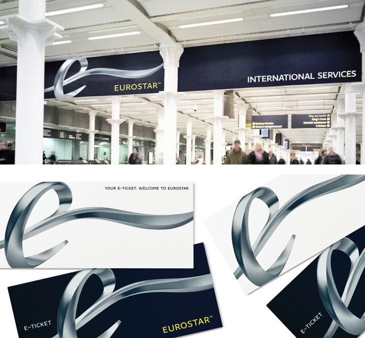
Eurostar, the high speed train service that runs between London and greater Europe, is getting an ambitious new logo and identity system courtesy of London-based SomeOne.

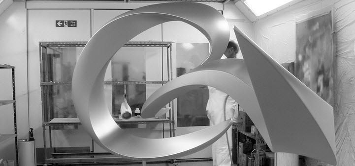
At the core of the Eurostar rebrand is a three dimensional logo based on an actual sculpture originally designed in CAD program Maya, then built as a physical 3 meter prototype.

Custom pictograms were developed to help guide international passengers on the service.

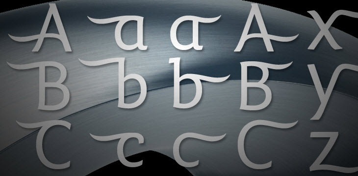
A custom typeface was created to complement the visual identity.

The Verdict
As a 3D sculpture there is no doubt that logo looks very impressive. I’m just not sure that it works well in applied to a flat surface. While I think the logo stops short of being tacky, the 3D effects are certainly something I am uncomfortable with.
With that said however, with many identity systems, sometimes you need to see them up-close and personal to gain a full appreciation. While it may seem like a bit of a cop-out, I have a feeling this could be one of those cases.
SomeOne, led by its co-founder Simon Manchip, are intent on pushing the boundaries of visual identity design through rebranding projects like this one. At worst the new Eurostar identity is bold and ambitious, and that is something I can’t help but admire.
More here:
Eurostar – Identity Designed
Eurostar’s sculptural new identity – Creative Review
Eurostar’s Swoopy, 3-D Logo Reflects Big Ambitions – Fast Co Design