HTML5 Logo Unveiled – The Future of the Web
A new logo for HTML5 has been unveiled by the W3C – the international community responsible for developing standards for the web.

The new logo will primarily act as a badge for web designers and developers, giving them a standardized symbol to inform visitors that parts of HTML5 has been implemented into their site. Important to note however, the logo does not imply validity or conformance with web standards.

The new identity for HTML5 was developed by Honolulu-based Ocupop. Here is an excerpt from the Ocupop blog explaining the new design.
The HTLML5 logo goes beyond simply representing the HTML5 spec to embody the technology, and the open web movement, at its core. This starts with standardization — the logo and its progeny follow very strict geometric rules providing an incredibly adaptable yet stable and stylish identity. As you’ve hopefully seen out on the web, the logo, the icons, the colors and the type all work, and work well, in nearly every imaginable context (and probably contexts beyond our imaginations). From favicons to billboards, this mark was designed to hold together in the face any manipulation. Through simple adjustment of hue, the logo conveys incredible depth and dimension without dated or awkward flourishes. With just two shades of orange and two shades of gray, the standard logo offers a thoroughly refined and assuredly lasting visual impact. The container for the logo is shaped as a badge, implying both the formality and respect an undertaking of this magnitude demands, but also as a homage to the progressive community that proudly, and relentlessly, ushers in the future of web technologies. Simultaneously a badge of honor and a coat of arms, this crest represents the spirit and substance of the open web platform and the forward thinking community making it a reality.
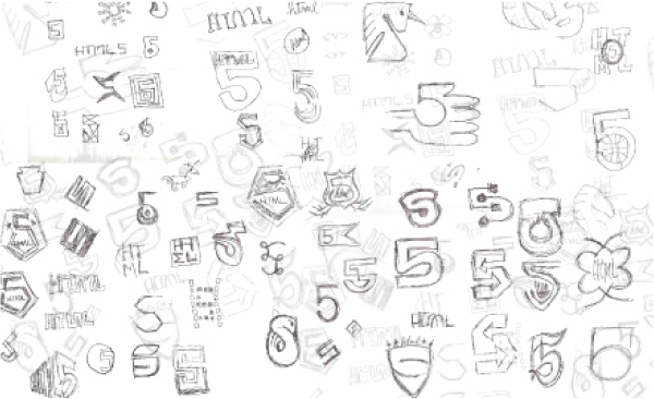
Below are a series of sketches drawn during the development of the logo. A nice look behind the scenes. Note the unicorn top-center…

Along with the logo, a nifty set of icons was also developed (below) to represent the different technologies surrounding HTML5. The icons are clean and communicative – nothing to complain about here really.
In order from left to right; 3D Effects, Connectivity, Device Access, Multimedia, Offline Storage, Performance, Semantics, Styling. ![]()
Overall, I think this is a very well executed logo. The design is strong and bold – something I can see web developers and designers adopting in droves.
Expect the new HTML5 logo to be appearing on a website near you soon.

What do you think? Please share your opinion in the comments section below.
####
Like this post? Please subscribe to our RSS feed and follow us on Twitter.