New York-based design firm, COLLINS, has developed a permanent mark to honour 10 years passing since the tragic events of 9/11, 2001.
From honoring911.com:
For us‚ this mark conveys the challenging but eternal lesson of that morning: we are as one. Just as we fall together‚ we can only rise together. Living with such empathy for one another is a steep mountain to climb. But we believe it is both the path out of 9-11 and the path we must… Read more
Brandversations is a project by Stefan Asafti that pits competing brands against one another. Each brand’s logo is composed of the logo of its long standing competitor. Brand slogans have also been switched.
There have always existed disputes among the competing parties, divergent opinions, while the fans of each brand were convinced that theirs was the best product. Last, but not least, the rivals have even conducted ad campaigns against the competing brands. This project mostly approaches the visual “conversations”… Read more
Really digging the identity for Great British Chefs by London-based studio Hat-Trick. The way they have developed the C-shaped logo around different kitchen utensils is brilliant. Very well executed.
The Great British Chefs brand is centered around a new iPhone and iPad app. The app features videos, cooking techniques, and recipes from 12 of Britain’s best Michelin-stared chefs.
Source: Richard Baird.… Read more
Brand guidelines don’t get much more geek-cool than this.
Via Blair Thomson.… Read more
The Science Channel has been rebranded by creative studio and production company, Imaginary Forces.
The rebrand is centred around a fictional character, Morph – whom you will meet in the slick introductory video below.
In an interview with Fast Co. Design, Art Director Ronnie Koff boldly states:
Now that technology has reached the point where everything is some moving form of media, logos are going to be designed for that kind of media first. There’s no reason to make a… Read more
An Apple Store under construction in Hamburg, Germany has been vandalised with a Windows logo.
A group called .wav (We Are Visual) posted this video of the prank in action.
It’s surprising to see how easy the stunt was to pull off.
Just a bit of harmless fun.
Via Edible Apple… Read more
Just stumbled across this outstanding Flickr set titled, Retro Logo Goodness — a study in retro/vintage logos.
Nothing like a bit of logo porn to cap off a busy week. Enjoy!
See the full Flickr set here.
Source: Coudal… Read more
This “We Love Logo” poster is from GoodLogo.
consists of 82 black, 38 red and 1 black & red colored logos. The logos are positioned on a grid in such a way a red heart is constructed out of the red logos.
Offset prints available for purchase for €15.00.
Nice poster. Too bad it’s probably illegal.
Source: Quipsologies… Read more
Eurostar, the high speed train service that runs between London and greater Europe, is getting an ambitious new logo and identity system courtesy of London-based SomeOne.
At the core of the Eurostar rebrand is a three dimensional logo based on an actual sculpture originally designed in CAD program Maya, then built as a physical 3 meter prototype.
Custom pictograms were developed to help guide international passengers on the service.
A custom typeface was created to complement the visual identity.… Read more
The organisers of the 2011 Shenzhen World University Games obviously don’t think much of the London Olympics logo.
And the close-up.
Oops.
via Johnson Banks… Read more
A redesign of the Google Chrome logo has just been unveiled.
While this may not be ground-breaking news, with Chrome being a favoured web browser among our readers, I thought this was at least worth a mention.
Personally, I think the removal of the previous logo’s tacky 3D effects is a step in the right direction. Yet another win for simplification.
For your reference, the old Google Chrome logo is pictured below.
What do you think?… Read more
Taking dynamic identities to the extreme, MIT Media Lab gets a fresh new logo, with no less than 40,000 variations.
The identity system was designed by Brooklyn-based Richard The. Here is an except explaining his reasoning behind the logo:
The logo is based on a visual system, an algorithm that produces a unique logo for each person, for faculty, staff and students. Each person can claim and own an individual shape and can use it on their business card a… Read more
Designer and illustrator, Phil Pascuzzo on redesigning the Twitter bird logo.
Biz (Twitter Co-founder) had sent over the bird mark that he designed, which Twitter was using at the time. I think he said something to the effect of “can you redesign this logo and add some Phil-style.” Being a Twitter newbie, I did some research and asked friends that used this communication tool so that I had a better idea of what the product was. Giving the mark more… Read more
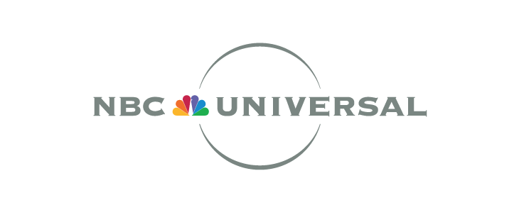
A new logo controversy is upon us with the news that the NBC Universal logo has been redesigned – dropping its globe silhouette and iconic Peacock.
The redesign marks the takeover of NBC Universal by media conglomerate Comcast. With the takeover NBC Universal has also been renamed to NBCUniversal.
Old NBC Universal Logo
New NBCUniversal Logo
Before getting all up in arms about the change it is important to note that the iconic NBC network logo (pictured below) will remain… Read more
A new Starbucks logo has been unveiled.
“we’ve given her a small but meaningful update to ensure that the Starbucks brand continues to embrace our heritage in ways that are true to our core values and that also ensure we remain relevant and poised for future growth.”
– Howard Schultz, Starbucks president and CEO
A well executed logo redesign
As one of the most recognised brands in the world, this logo redesign is a bold move for Starbucks.
What the… Read more

The new Rio 2016 Summer Olympics logo was unveiled on New Year’s Eve at a Copacabana beach party in Brazil.
According to the official Rio 2016 Olympic games website:
The brand translates the Olympic spirit and the nature, feelings, and aspirations of the athletes, Rio and the cariocas. Different countries, athletes and peoples are joined in a warm embrace – in an individual and collective move, which at a second glance, reveals one of Rio’s most beautiful icons, a vibrant… Read more
Page 1 of 11