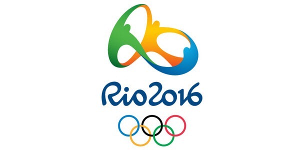
Rio 2016 Olympics Logo

The new Rio 2016 Summer Olympics logo was unveiled on New Year’s Eve at a Copacabana beach party in Brazil.
According to the official Rio 2016 Olympic games website:
The brand translates the Olympic spirit and the nature, feelings, and aspirations of the athletes, Rio and the cariocas. Different countries, athletes and peoples are joined in a warm embrace – in an individual and collective move, which at a second glance, reveals one of Rio’s most beautiful icons, a vibrant Sugar Loaf, radiating joy, unity, celebration, and friendship.
The new logo was modelled as a dynamic 3D design that event organisers plan on implementing at various stages of the games. Its usages will include 3D sculptures, animations and laser light shows. The options are endless really.
Cue a promotional video for the logo. Skip to 2.25 to see the 3D logo in use.
The Verdict
While the logo is inoffensive, the concept of ‘people joined in embrace’ is predictable and the concept really brings nothing new to the table. Its not ground-breaking, but then again perhaps Olympics logos aren’t meant to be.
London 2012 tried something different and was overwhelmingly criticized for it.
What do others think of the Rio 2016 logo? Having browsed through Twitter and Facebook, the reactions do seem mixed. While the designer and event organisers say that the logo is supposed to resemble the iconic Sugarloaf mountain, some have already commented that it looks more like another Brazilian icon, the thong…
What do you think?
###
If you liked this post, please subscribe to our RSS feed and follow us on Twitter.